
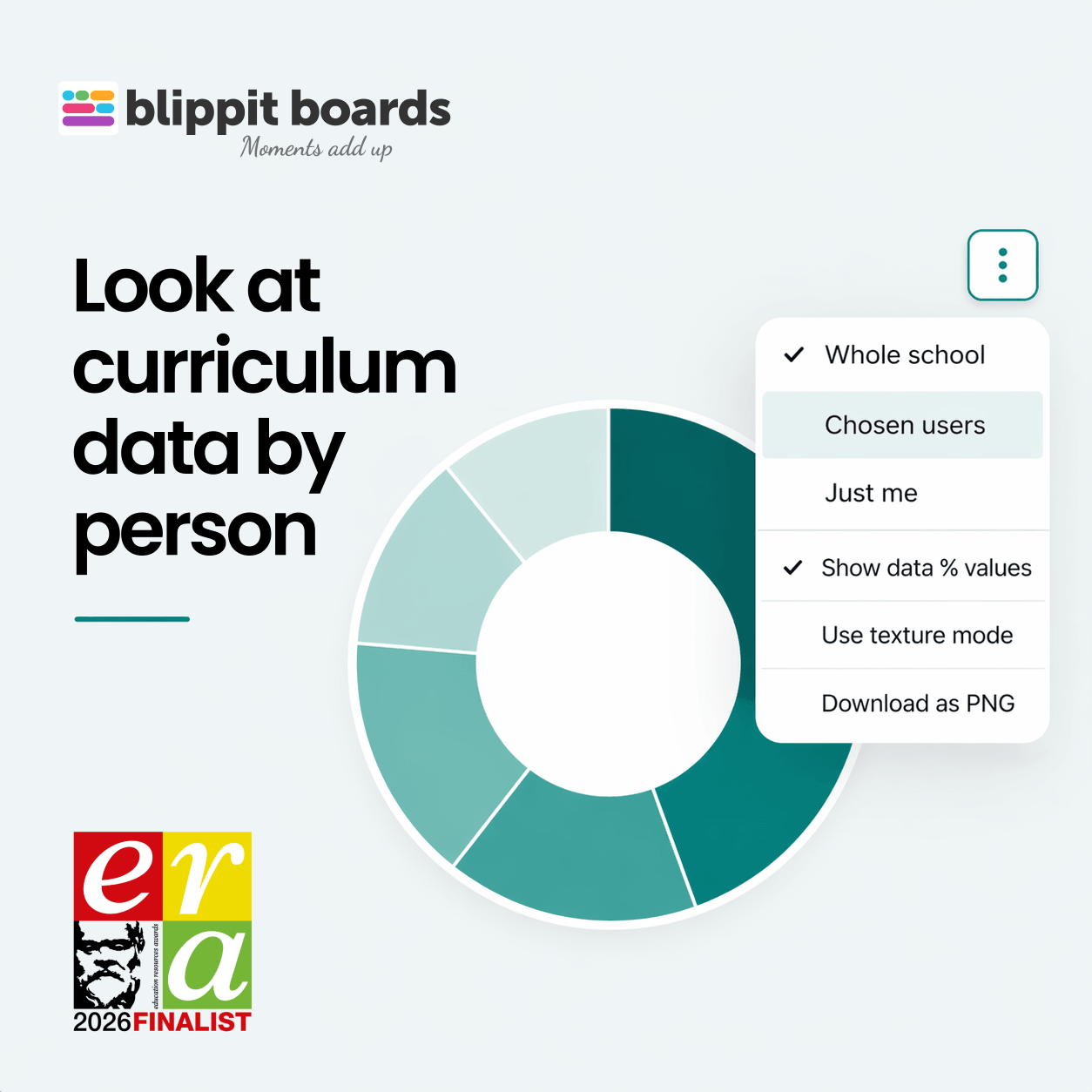
Until now, charts in Blippit Boards have shown whole-school, key stage, or year group data.
That gives you a clear picture of overall coverage - but not how that picture is built.
You can now filter any chart by individual teachers, a group of teachers, or just yourself.
This means you can see not just what is being recorded, but how that data is distributed across people.
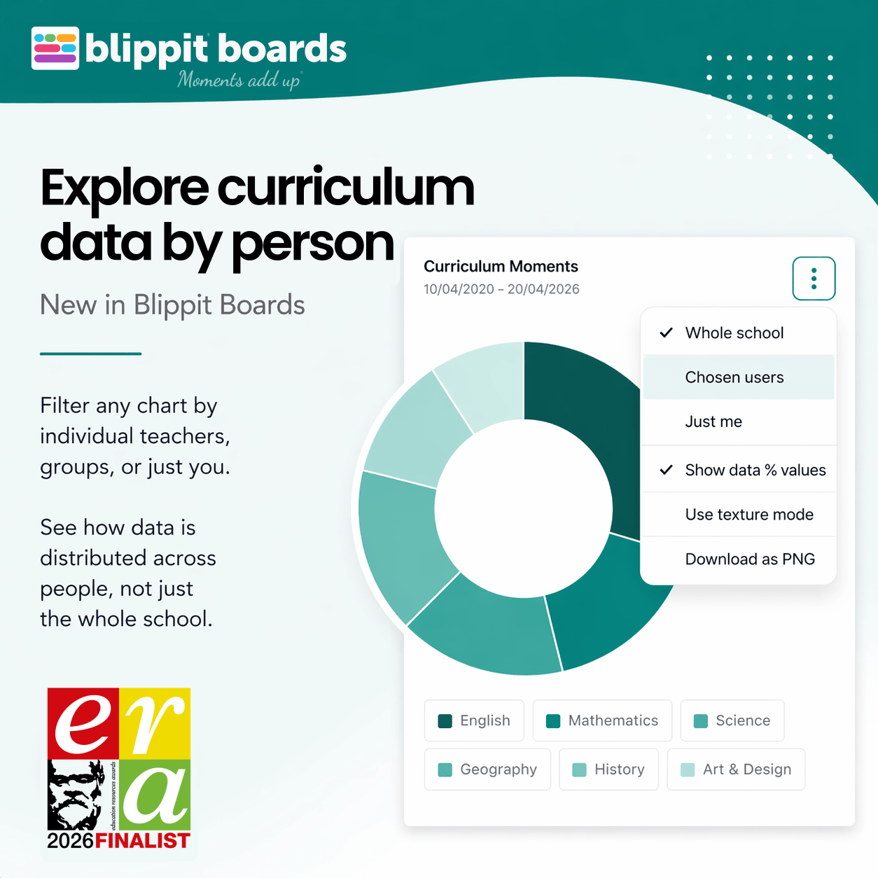
From a whole-school chart, you can already see which areas are well represented.
With the person filter, you can now also see:
Open any chart and select from the 3 vertical dot menu:
You can combine this with any date range.
This doesn’t change what data is collected.
It gives you a clearer view of how that data is distributed across people.
Write about something from your classroom and get structured thinking back - privately, in two minutes, with no sign-up.
Try a free reflection →No account needed. Not stored by Blippit.


