Use the date range selector above the chart to set a time frame over which evidence will be shown in a chart of viewed in a timeline. Personalise the chart title before sharing it for use in a report, discussion or presentation of your own.
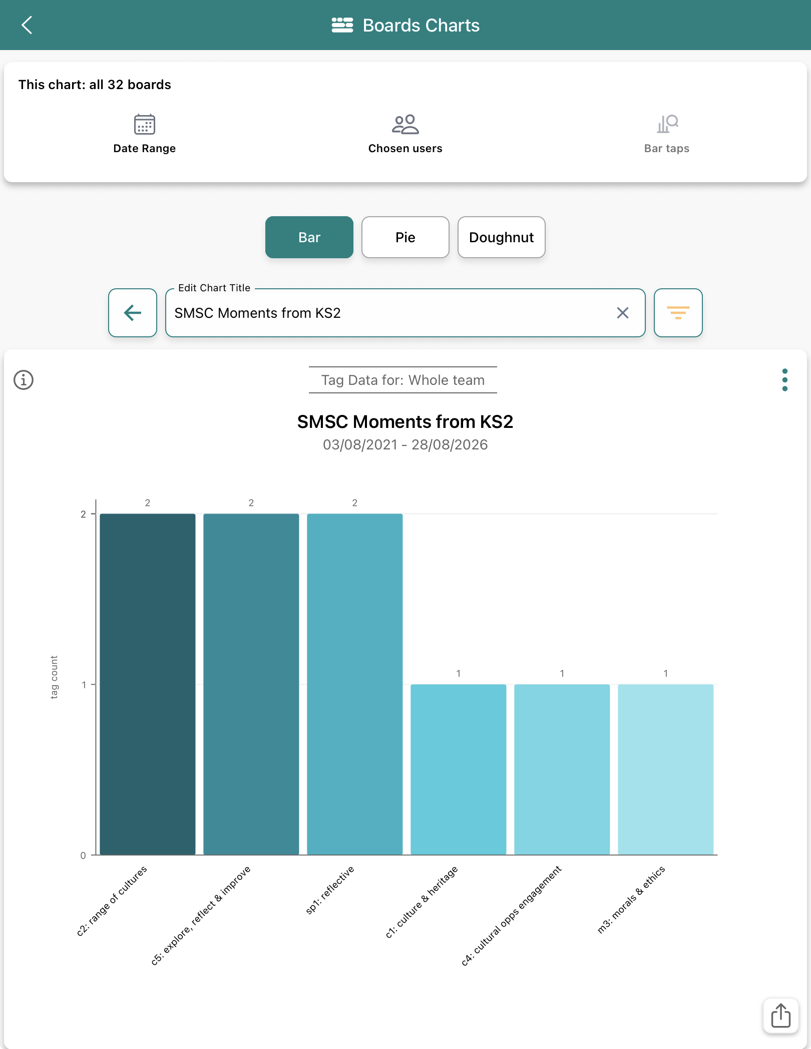
Below is an example showing a KS 2 SMSC chart. See the orange filter icon indicating that there is a filter in place acting on the data shown, in this case, a KS 2 filter.
How to select a specific date range for a chart
This applies for 'Chosen users' too if you want to see a data view for a specific person.
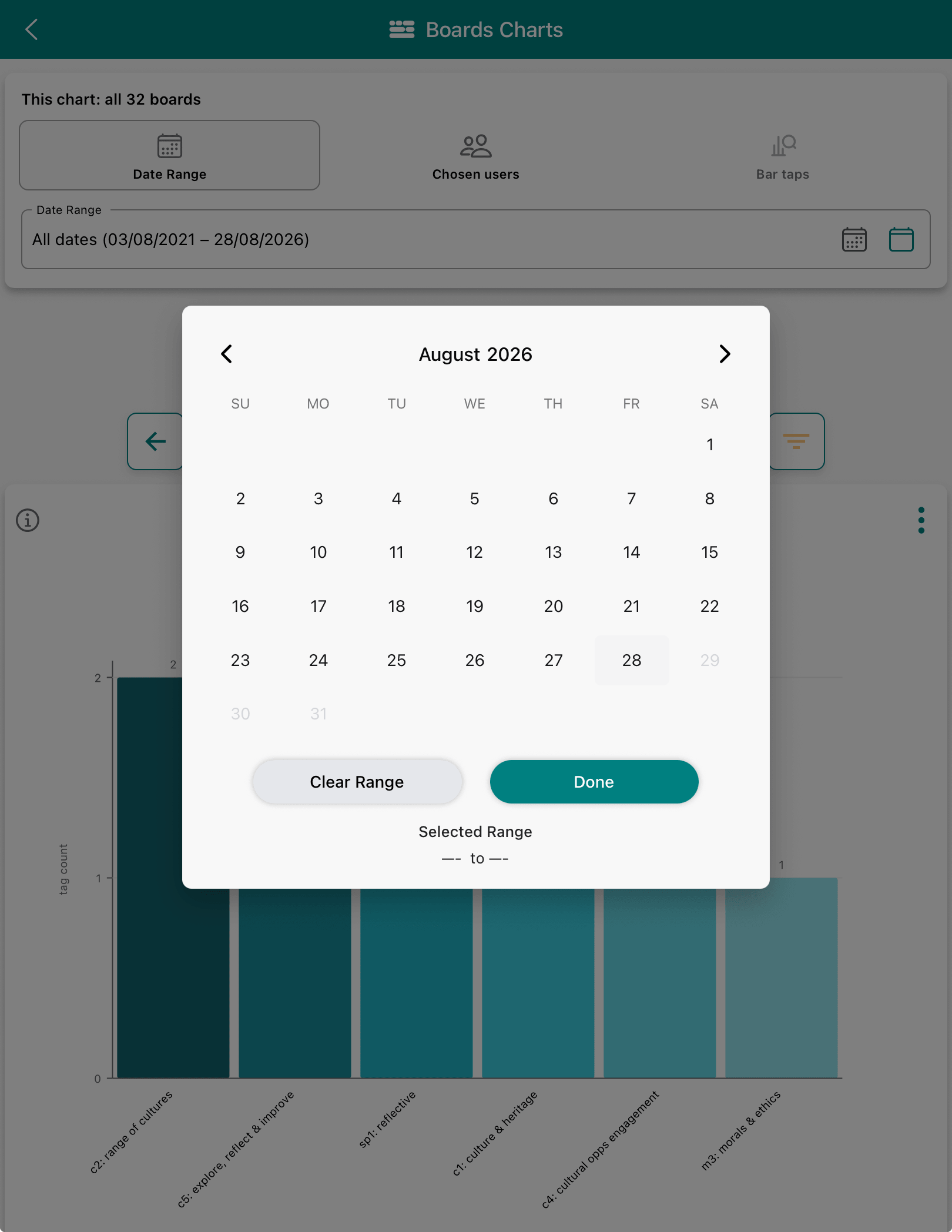
Click the calendar icon, tap to choose the start and end date range.
Tap 'Clear Range' to start again.
Remember
The date range applies to boards and the charts.
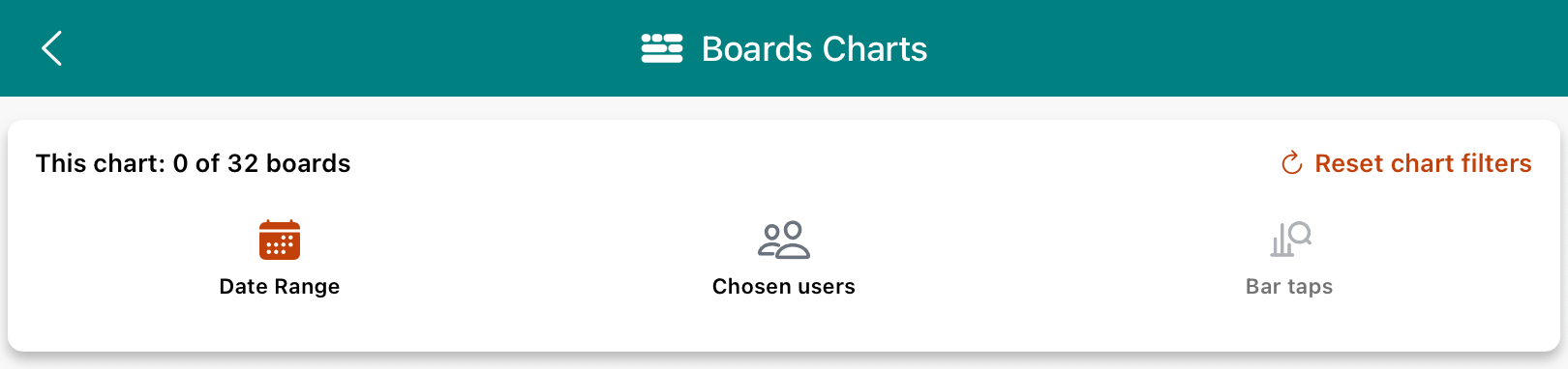
The red calendar icon indicates a date constraint is applied to what you can see.
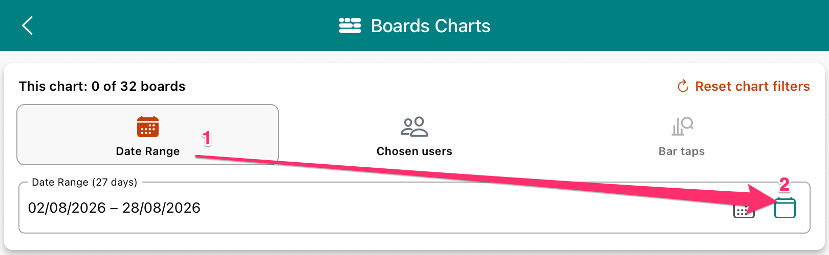
To reset and see the full date range, tap the big red calendar icon -> tap the small green calendar icon
Alternatively, just tap 'Reset chart filters'
Red calendar icon means a date range is being applied to what you can see